
The bell curve
Why so many measurements pile up in a bell shape, and the 68-95-99.7 rule that tells you how unusual a value is.
Histogram
A chart that sorts values into bins (equal slices, like 70 to 78, 78 to 86) and draws one bar per bin. The height of each bar is how many values fell into that slice. It shows the shape of the data at a glance: where it piles up, how wide it is, whether it leans to one side.
Test scores from 1,000 people, binned in steps of 8 points: the tallest bar sits around 100, and the bars get shorter the further you go either way.
Check yourself
In a histogram of test scores, what does the height of each bar tell you?
- The average score of the people in that bar
- How many people scored within that bin's range
- The highest score anyone got
- How far that bin is from the mean
Show the answer
How many people scored within that bin's range
Right. Each bar counts the values that fell into its slice. Tall bars are where the data piles up.
Step through it
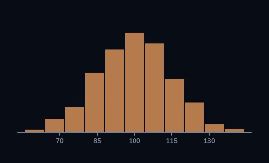
Test scores, grouped into bars Test scores from many people, grouped into eleven orange bars along an axis marked 70, 85, 100, 115 and 130. The tallest bars sit near 100, and they fall away on both sides in a roughly even way: most people land near the middle.
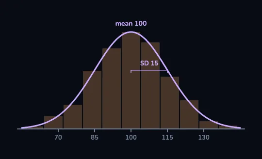
Smooth the bars into a bell A smooth lilac curve is drawn over the bars, which fade behind it: the bell curve. Its peak is labelled mean 100, and a small bracket from 100 to 115 is labelled SD 15. Those two numbers, the centre and the width, are all it takes to draw it.
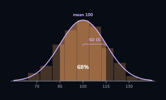
Within one SD: about 68% The area under the curve from 85 to 115, one SD either side of the mean, fills orange and is labelled 68%. About 68 in every 100 people score in that band.
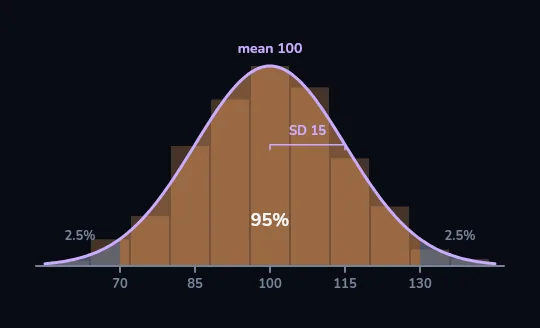
Within two SDs: about 95% The orange fill widens to 70 to 130, two SDs either side, now labelled 95%. The two thin tails beyond it are tinted grey and marked 2.5% each: only about 2.5 in 100 people score above 130, and about as many below 70.
Check yourself
Scores have a mean of 100 and an SD of 15. About what share of people score between 85 and 115?
- About 50%
- About 68%
- About 95%
- About 99.7%
Show the answer
About 68%
Right. 85 to 115 is one SD either side of the mean, and about 68% of a bell curve sits there.
THE NORMAL DISTRIBUTION
A shape set by two numbers
The idealised bell is called the normal distribution. It is symmetric, with one hump, and at its peak the mean, median and mode are all the same value. Once you know its mean (where the centre is) and its SD (how wide it is), you know the whole shape. Why is it so common? When a result is the sum of many small, independent influences, like the many genes and habits behind a height, or the many questions on a test, the total tends toward a bell. Statisticians call this the central limit theorem.
Adult heights within one sex, small errors when you weigh the same thing again and again, and scores on tests built from many questions all come out roughly bell-shaped.
The 68-95-99.7 rule
- About 68% of values lie within 1 SD of the mean. On our test: 85 to 115.
- About 95% lie within 2 SDs: 70 to 130.
- About 99.7% lie within 3 SDs: 55 to 145.
- What's left over splits evenly between the two tails: of the 5% outside 70 to 130, about 2.5% are above 130.
- It only works for data that really is roughly bell-shaped.
Check yourself
Same test: mean 100, SD 15. Roughly what share of people score above 130, like Sara?
- About 2.5%
- About 5%
- About 16%
- About 32%
Show the answer
About 2.5%
Right. About 95% score between 70 and 130, so 5% are outside, and half of that, about 2.5%, are above 130. Roughly 1 person in 40.
z-score
How many SDs a value is from the mean. Above the mean it's positive, below it negative. Because it measures distance in SDs rather than in points, it lets you compare results on completely different scales: on any bell-shaped measure, a z of +2 is equally rare.
Sara's 130 is 30 points above a mean of 100 with an SD of 15, so z = +2. A height 2 SDs above average for its group is just as unusual as her score.
Check yourself
Omid scores 1 SD above the mean on a maths test and 2 SDs above the mean on a language test. Both tests are roughly bell-shaped. Which result is rarer?
- The maths result, 1 SD above
- The language result, 2 SDs above
- Neither: you can't compare different tests
Show the answer
The language result, 2 SDs above
Right. About 16% of people score more than 1 SD above the mean, but only about 2.5% score more than 2 SDs above. z-scores make different tests comparable.
Check yourself
Which of these are likely to come out roughly bell-shaped, and which are skewed?
- Heights of adult women in one country
- Household incomes
- Small errors of a kitchen scale weighing the same bag
- House prices in a city
- Scores on a 60-question exam
- Minutes spent waiting at a clinic
Show the answer
Roughly a bell: Heights of adult women in one country, Small errors of a kitchen scale weighing the same bag, Scores on a 60-question exam
Skewed, not a bell: Household incomes, House prices in a city, Minutes spent waiting at a clinic
Lesson recap
- A histogram counts how many values fall in each bin; many measurements pile up into a single, symmetric hump.
- The normal distribution is set by two numbers: the mean (centre) and the SD (width). Mean, median and mode meet at the peak.
- It's common because sums of many small, independent influences tend toward a bell.
- With mean 100 and SD 15: about 68% score 85 to 115, about 95% score 70 to 130, and about 2.5% score above 130.
- A z-score counts SDs from the mean, so it compares different scales; but skewed data like incomes doesn't follow the rule.